The new tools utilize preset design elements, streamlined controls and enhanced flexibility while you build a professional store. This guide will survey the big changes with our design tools v2 so you can start using them or migrate from our classic design tools to our new ones right away. We're proud of our leap forward and we can't wait for you to try it out!
| 1 | New Themes |
| 2 | Style Editor |
| 3 | Blocks - Placement, Styles and Design |
| 4 | Custom Code |
| 5 | Learn More |
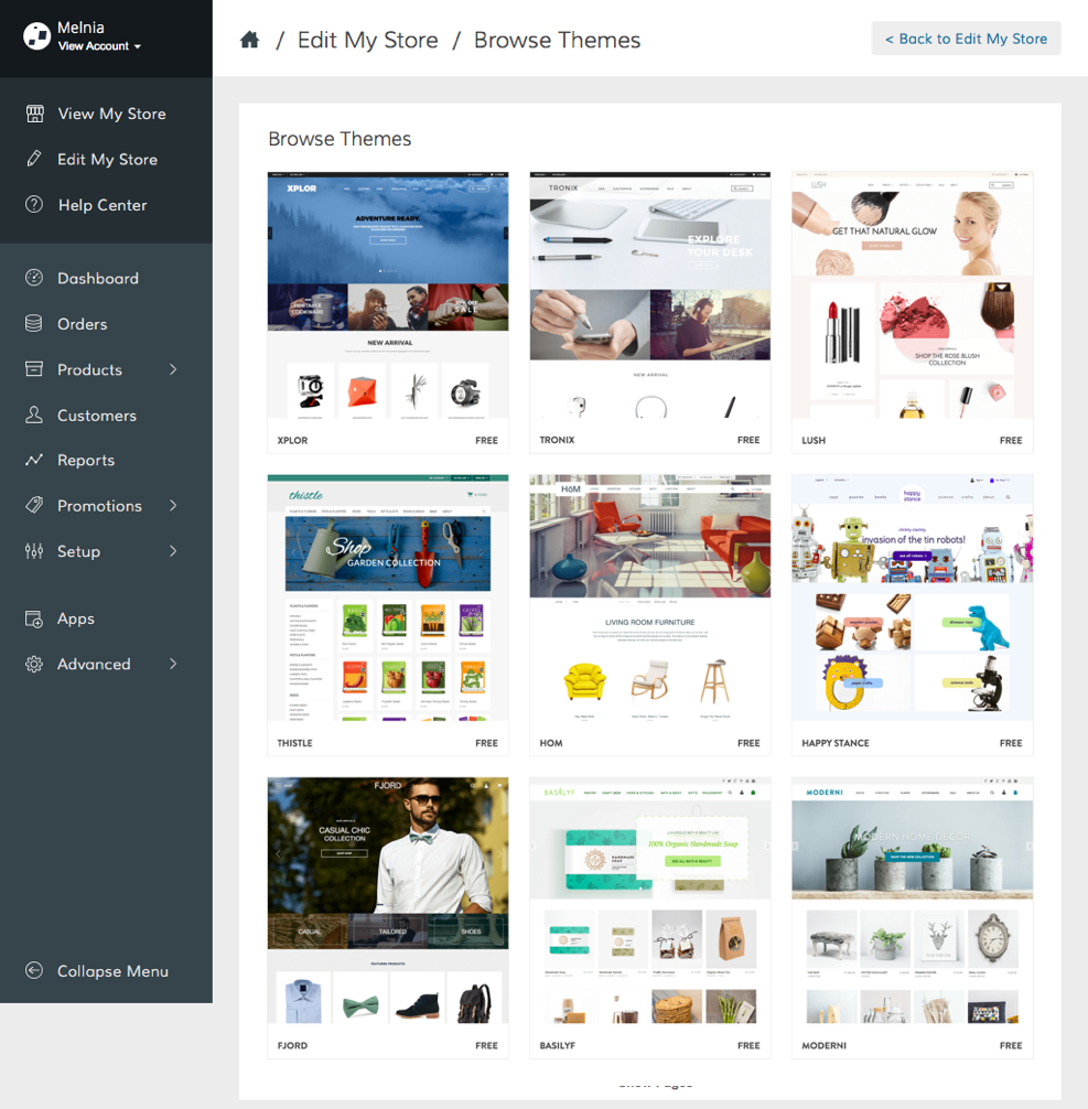
New Themes
We released a new set of themes you can try out immediately. These templates are free to install, and work responsively. You can install several themes and switch between them at any time. Choose a template to serve as a foundation for your store's design and layout, then get to work!
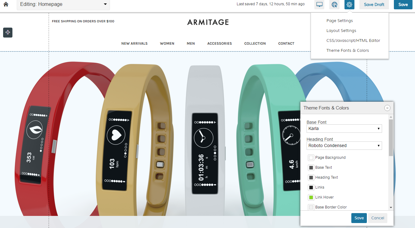
Style Editor
The global style editor changed location and name, although you can still use this feature to change fonts and colors that apply to all your pages.
The style editor can be opened from within any page of your theme. Go to Edit My Design > Edit Page, click on the gear icon in the top right and select Theme Fonts & Colors.
Blocks - Placement, Styles and Design
- Placement: You can drag and drop blocks throughout your store, giving you added flexibility to your layout. Just hover over the + icon and click on Add, then select from the Block Menu the block you want to add to your page. You can drag and drop into a specific place within a page or you can just click on a style and it automatically adds it to the bottom of a page.
Note: Not all pages offer the same block selection.
- Styles: You have now the option to select from different styles that come preset with each block. This allows you to create an individual style without the need to use custom code.
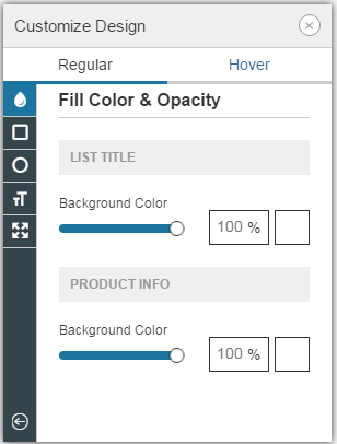
- Design: You can now customize colors, fonts, corners and padding for individual blocks. Just hover over the block you want to edit and click on Design.
- More block options: We have added more options to the block settings, which allow you to copy, paste, duplicate and delete a block with a right click and short cuts.
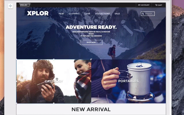
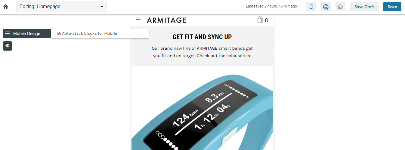
Preview and edit of desktop, tablet, and mobile display
You can view your site as it appears from a variety of screen sizes: desktop, tablet, and mobile. From those real time display previews, you can make adjustments to ensure your store looks good on any device. Best of all, you can now select to Auto-stack blocks for mobile views. You can also choose to hide blocks for the mobile view to ensure a neat layout across all devices and browsers.
Custom Code
The new design features will allow you to create a beautiful design without the need of custom code. If you want to add HTML code to any page you add an HTML block from the block menu.
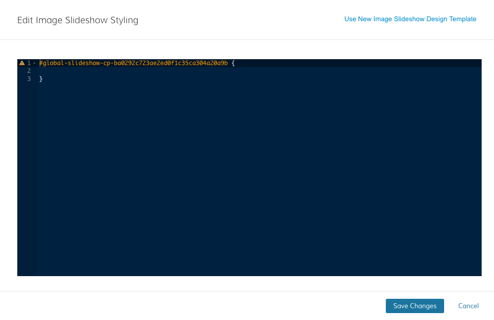
Although you will not be able to add custom code to individual blocks, you still can add CSS, HTML or Javascript that applies globally to your store. Just go to Edit My Design > Edit Page and click on the gear icon (cog) in the top right. Select CSS/ Javascript/ HTML Editor to add any custom code.
Please note that we are not able to assist, fix or troubleshoot any custom code related workarounds.
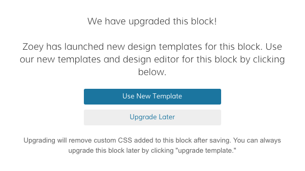
If you are currently using design elements (blocks) that have custom code added, you will have the option to keep the design with your code or switch to our new, preset styles.
Before switching to a new design element, you will get different messages.
First message:
If you select Upgrade Later you will see the second message:
From here you can select Use new Design Template and you will get a third message to confirm:
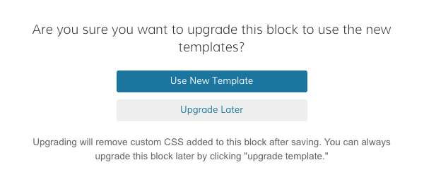
Important: Switching to a new design element will remove the custom code irrevocably once you saved the changes.
Comments
0 comments
Please sign in to leave a comment.